Your restaurant menu is not just a list of dishes and prices. It is your most powerful sales tool, a silent salesperson that works every table, every shift, every day. Research from Cornell University's School of Hotel Administration shows that strategic menu design can increase profits by 10 to 15 percent without changing a single recipe. In this guide, we break down the psychology, layout principles, and writing techniques that turn an ordinary menu into a revenue driver.
Understanding Menu Psychology
Before you choose fonts or rearrange sections, it helps to understand how diners actually read a menu. Eye-tracking studies reveal that most people scan a menu in a predictable pattern. On a single-page menu, the eyes tend to land first in the upper-right area, then sweep to the upper-left, and finally settle in the center. This pattern, sometimes called the "Golden Triangle," means the items you place in those three zones get the most attention.
Use this insight deliberately. Place your highest-margin dishes, often appetizers, specialty entrees, or chef's features, in those prime positions. Avoid burying them at the bottom of a long list where they compete with dozens of other options.
Another well-documented effect is the paradox of choice. When a category contains more than seven or eight items, diners take longer to decide and often default to something familiar and safe, typically one of the cheaper options. Trimming each category to five to seven carefully curated dishes speeds up ordering and nudges guests toward the items you actually want to sell.
Strategic Pricing That Feels Natural
Pricing format has a measurable impact on spending. A classic study published in the International Journal of Hospitality Management found that guests spend more when prices are listed as plain numbers without dollar signs or decimal points. "Grilled Salmon 24" feels less transactional than "Grilled Salmon $24.00." The dollar sign activates the psychological pain of paying, and removing it reduces that friction.
Avoid dotted leader lines that connect item names to prices. These "dot trails" encourage price comparison shopping and train the eye to jump straight to the number, skipping your lovingly written description entirely. Instead, tuck the price quietly at the end of the description or on the same line as the item name, in a slightly smaller or lighter font.
Anchor pricing is another powerful technique. Place a premium item, your most expensive steak or a luxurious seafood tower, near the top of a section. Even if few people order it, the high price reframes everything below it as reasonable by comparison. A 28-dollar pasta feels like a bargain next to a 55-dollar wagyu ribeye.
Writing Descriptions That Sell
Descriptive labels can increase sales of an item by up to 27 percent, according to research from the University of Illinois. The key is specificity. "Chicken sandwich" tells the diner almost nothing. "Herb-brined free-range chicken with roasted garlic aioli, pickled red onion, and arugula on a toasted brioche bun" paints a vivid picture and justifies a higher price point.
There are four types of descriptive language that consistently work well. Geographic labels like "Tuscan," "Cajun," or "Thai-inspired" evoke a sense of place and authenticity. Nostalgic labels like "Grandma's recipe" or "old-fashioned" create emotional connection. Sensory words like "crispy," "slow-roasted," "smoky," or "velvety" trigger taste imagination. And preparation method terms like "hand-rolled," "stone-fired," or "48-hour brined" signal craft and care.
Keep descriptions to two lines maximum. Anything longer and diners skip them entirely. Every word should earn its place.
Layout and Visual Hierarchy
Group your menu into clear, logical categories: starters, mains, sides, desserts. Within each category, lead with the item you most want to sell and end with another strong choice, since people tend to remember the first and last items in a list.
Use visual callout boxes, borders, or subtle background shading to highlight one or two signature dishes per section. These "chef's picks" or "house favorites" draw attention without feeling pushy. Just do not overdo it. If every item has a star or a box around it, nothing stands out.
White space is your ally. A cluttered menu with tiny fonts and narrow margins feels overwhelming and cheap. Generous spacing between items and sections makes the menu feel curated and upscale, even at casual price points. Aim for a font size of at least 11 points for descriptions and 13 to 14 points for item names.
Choosing the Right Format
The format of your menu, single page, bifold, trifold, or digital, affects how guests interact with it. Single-page menus work well for focused concepts with 20 to 30 items. They are easy to scan, and the Golden Triangle effect is strongest here. Bifold menus suit mid-sized operations with 30 to 50 items and let you dedicate the right panel to high-margin categories. Trifold menus handle larger selections but risk overwhelming diners if not carefully organized.
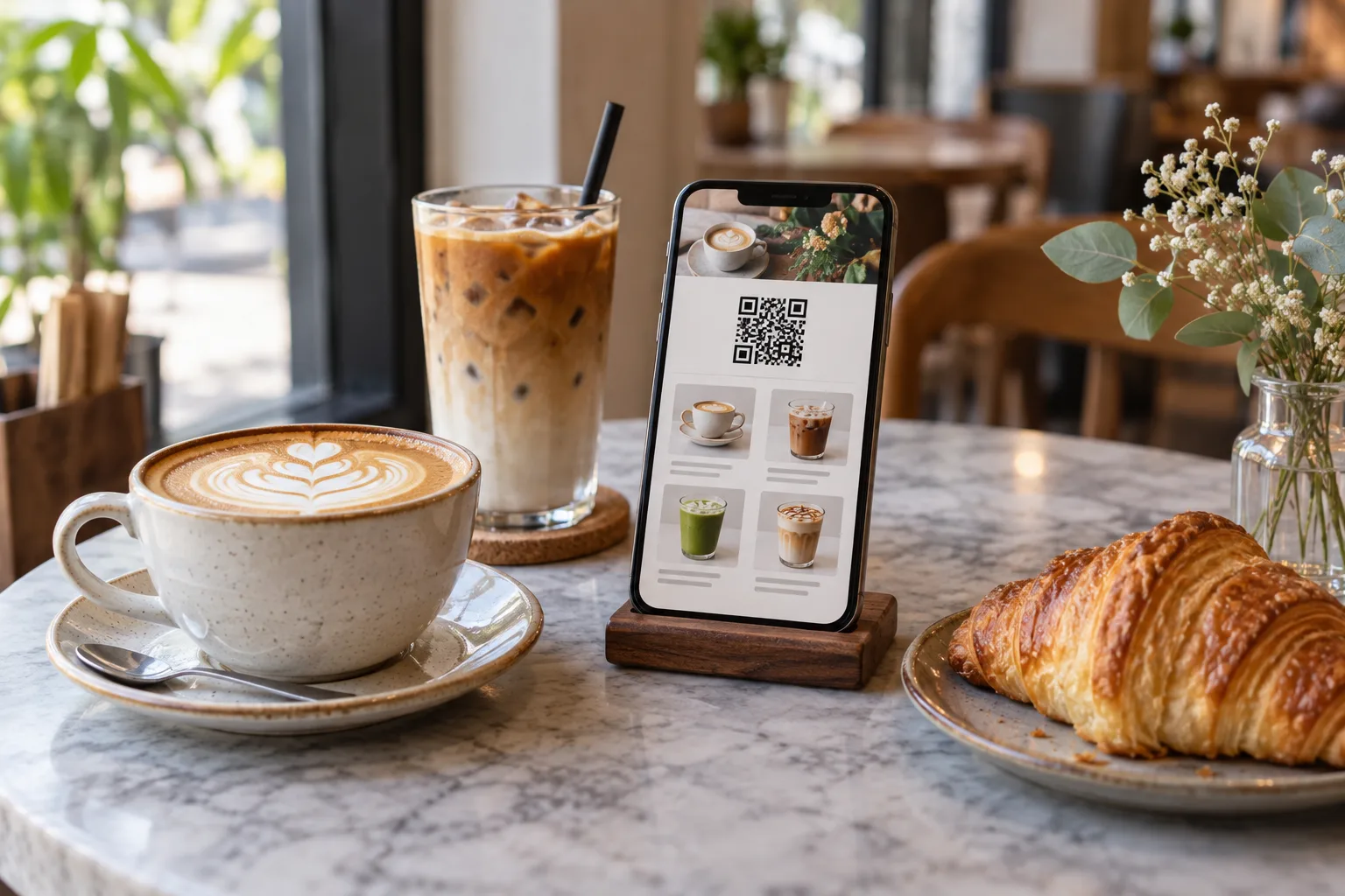
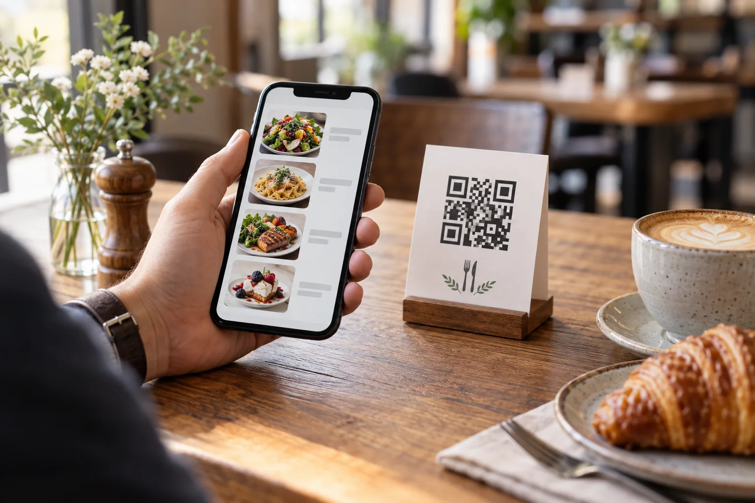
Digital menus offer unique advantages that paper cannot match. You can update prices instantly when ingredient costs change, rotate seasonal specials without reprinting, and add photos that increase order rates for featured items by up to 30 percent. Tools like GetFreeMenu let you create and update a digital menu in minutes, with QR code access so guests can browse on their own phones.
Photography: When and How to Use It
Food photography can dramatically boost sales of specific items, but only if the images are high quality. Blurry smartphone shots under fluorescent lighting will hurt your brand more than no photos at all. If you invest in photography, follow these guidelines: use natural or warm-toned lighting, shoot from a 45-degree angle or directly above, include garnishes and props that reflect your brand's style, and keep the background clean and uncluttered.
You do not need to photograph every item. In fact, selective photography is more effective. Feature photos for three to five signature dishes per category. This makes those items stand out while keeping the menu clean.
Testing and Iterating
Menu design is not a one-time project. Track your product mix, the percentage of total sales each item represents, on a monthly basis. If a high-margin item is underperforming, experiment with its position, description, or visual treatment before removing it. If a low-margin item is outselling everything else, consider whether a small price adjustment or portion change could improve its contribution.
A/B testing is straightforward with digital menus. Try two different descriptions for the same dish and compare conversion rates over a two-week period. Move a starter section above mains for one month and measure whether appetizer sales increase. These small, data-driven adjustments compound into significant profit improvements over time.
Putting It All Together
A great restaurant menu balances art and science. Start with a clear understanding of your highest-margin items and your guests' decision-making patterns. Use the Golden Triangle for placement, clean visual hierarchy for scanning, vivid but concise descriptions for persuasion, and smart pricing formats to reduce sticker shock. Whether you print on heavy cardstock or display on a screen via QR code, these principles apply. The restaurants that treat their menu as a strategic asset, rather than an afterthought, consistently outperform those that do not.